Friday, 21 October 2011

College Magazine Research


Above is a College Magazine front cover that I found, I don't like this cover because it is too plain and very boring. I don't think it would appeal to the same target audience as me because of the formal aspect. The picture on the cover shows, what I presume, is the college itself, but it has been taken when it is empty so it doesn't show the exciting aspect of the college. Also, the writing is very formal and doesn't make the magazine look fun and interesting to read. Also the colours are very bland. Although this would appeal to a much older, mature audience.

This is another magazine front cover that I found, I much prefere this one because it is more exciting and would appeal to the same target audience as myself. It has a picture of a person which draws in the readers eye more because people may reconise him. The colours also stand out and are bright, unlike the other magazine cover.

Creating My Magazine - Front Cover

This is my front cover of my magazine. My front cover is the main piece as it is the first thing the reader will see when they pick up the magazine. Because of this I tried to make my front cover, bright, exciting but also modern and stylish as the target audience is young college students between the ages of 16-20.

My main aspect of my front cover is the 'Medium Close-up' of my friend on the front page. This makes the magazine look proffesional and also might make people want to read it if they reconise a fellow student on the front page. He is also relevent as inside the magazine there would be an article and him, 'Student of the month'. He is posed in a casual position because it looks calm and more sophiscated.

My Masthead is a bright red as it is the same colour as the Norwich City College logo which is relevant as it is a magazine for the college. I also added in a picture of the logo, but on low opacity so that it fits in the well with the rest of the front cover. My Masthead is placed at the top right corner so that the eye of the reader is drawn to this first and if the Masthead looks good they will want to read the front cover and hopefully want to buy the magazine. I named my magazine 'College BIZ' because it about College Business. I shortened the word Business to 'BIZ' because it felt more new and different and less formal. It also links in with the word 'Showbusiness' which will make the students feel almost famous if they are featured in the magazine.

Wednesday, 19 October 2011

Creating My Magzine - Contents Page


Above is my contents page, this is important as it shows whats inside the magazine and helps the reader determine wheather they wish to read and buy the magazine or not. Again, the design from the front cover links in with the contents page as I have used boxes with low opacity and I have used the same two fonts 'Bookman Old Style' and 'Berlin Sans'.

I have also keept with the same colours for the main titles and writing, black and red. with a white background. Also, I incorporated some light lines onto the background because I think it makes the page look more fun and exciting but also good looking. Again, I have added in the picture of the college logo with a low opacity because it links with the front cover and the college, the writing over the top of it is about the Student Union so those two objects fit well together.

(Skills Development) Creating My Magazine - Text, Medium Close-Up, Masthead and Background

Text is one of the most important aspects of a magazine, my magazine uses two different fonts, 'Berlin Sans' and 'Bookman Old Style'. The above picture is of the text on my front cover, I have used different sizes, styles and effects to make the cover different and more interesting. I have keept to three colours, red, black and white. The reason for this is because I want my magazine to have the same theme throughout to make it look more proffesional.

For my Medium Close Up picture, I took a picture of my friend. When I imported the picture onto photoshop I used the Select tool to cut my friend out and paste him onto a plain white A4 background.


I placed my masthead on the top right corner of the page as this is where the eye is first drawn to when people read magazines or website pages. I made the opacity of the layer a bit lower, but not as much as other layers because I wanted my Masthead to stand out.


After I had added all my content onto the front cover, I believe it looked too plain so I decided to add some coloured lines which would be repeated through out the magazine to make it look fuller and stand out more. I believe it goes well with the whole of my front cover because it looks fun and modern. To make these, I simply added boxes, changed the colours, but because the colours were to bright I changed the opacity of the boxes to make them a softer colour.

Creating My Magazine - Masthead

This is my Masthead that I designed, I like it because it is easy to read and simple. I kept to the theme of the City College Norwich logo because it is red. The word 'BIZ' is short for business and is also accociated with 'Showbiz' which is popular in main stream magazines. I used the font 'Berling Sans' for the word college and then I got a font off of www.dafont.com to write the word 'BIZ'.

Wednesday, 5 October 2011

Magazines I like♥

Click Here To View The Magazine     

I like this magazine because of the great pictures. It's not like a normal magazine with loads of articles, it is purely photos which I like because I love photography. I think the audience of this magazine would be young women aged between 17 -25 who are interested in fashion and also people who design clothes or own a fashion shop. All of the pictures in this particular issue are of one theme, this creates an atmosphere for the magazine. The theme is 'Urban Castaway'.


Click Here To View The Magazine

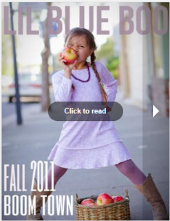
This also a similar magazine but is fashion for children and also it has more text and would be aimed at people with children or grandchildren. Again, I think it would be aimed at mums more than dads because fashion is more of a womans thing. I like the layout as it shows off the clothes nicely and gives it an innocent feel because of the models being children.


 Click Here To View The Magazine

This magazine is different to the ones I have just looked at, but I still like it because of the creative element. It is an art magazine. I love the layout inside the magazine because of its modern, simple feel which isn't crammed full of uneeded text. I like the front cover because it's different and interesting. On this magazine the Masthead of this magazine is unusual as it is at the bottom of the front cover.

CD Design Research

This is one of the covers I looked at for research. The band is Green day and the name of the CD is 'Internation Superhits' I like the colours and it represents to pop punk genre of the music. I think the silhouettes make the CD cover bold and interesting. Also, the poses that Green Day are in are instantly recognisable by Green Day fans as the lead singer and guitarist is at the front whereas the drummer is at the back.


This is another album cover I looked at, the band is Good Charlotte and the name of the CD is 'Morning Revival'. Good Charlotte does very similar music to Green day. I like this album cover because of the bold bright title which stands out, this is how I want my cover to be like. It also shows the band and again it has the main singer at the front with the drummer postioned at the back.

My Design Brief

CD Cover Design Brief


Band Name: The Option


Target Audience Demographic:  Between the ages of 15 – 20, Females and males, listen to music such as; Paramore, Green Day and Fall Out Boy. Wear clothes like black skinny jeans,’ Converse All Stars’ trainers, Band tee’s and Hoodies. Also stud belts and have a ‘relebish’ attitude towards life. Don’t like being told what to do, can sometimes be very independent but loves gigs.


Genre: Punk rock/Alternative rock


Imagery and colour schemes: Some dark colours but can also be bright, images like guitars, drums, spiky hair for men and brightly coloured hair for women, skinny jeans, stud belts. People at raves and gigs, mosh pits, graffiti and damaged things. Alcohol and drugs may be associated with this type of music.


Type Face/Font Styles: Bold, scruffy, red or white, must stand out, maybe a pink glow to add emphasis.

THIS IS MY DESIGN BRIEF WHICH I ORIGINALLY TYPED UP IN MICROSOFT WORD.

CD Back Cover and Spine

This is my CD backcover, it has a very similar design to the front cover as I have used the same colours, font and the same pictures. I have added a barcode and a small copyright paragraph to make the CD look more realistic. This time I have changed the speech bubble to a thinking bubble to make a small change which will make the whole design more interesting to look at aswell as keeping the theme the same.
Also, as I finished my front and back designs quite quickly I had time to make a spine for the CD. This would make the CD instantly reconisble if it was to be in a shelf amongst other CDS. I used the exact same title with the same design as it is simple and easy to fit into a narrow space.