Wednesday, 29 February 2012

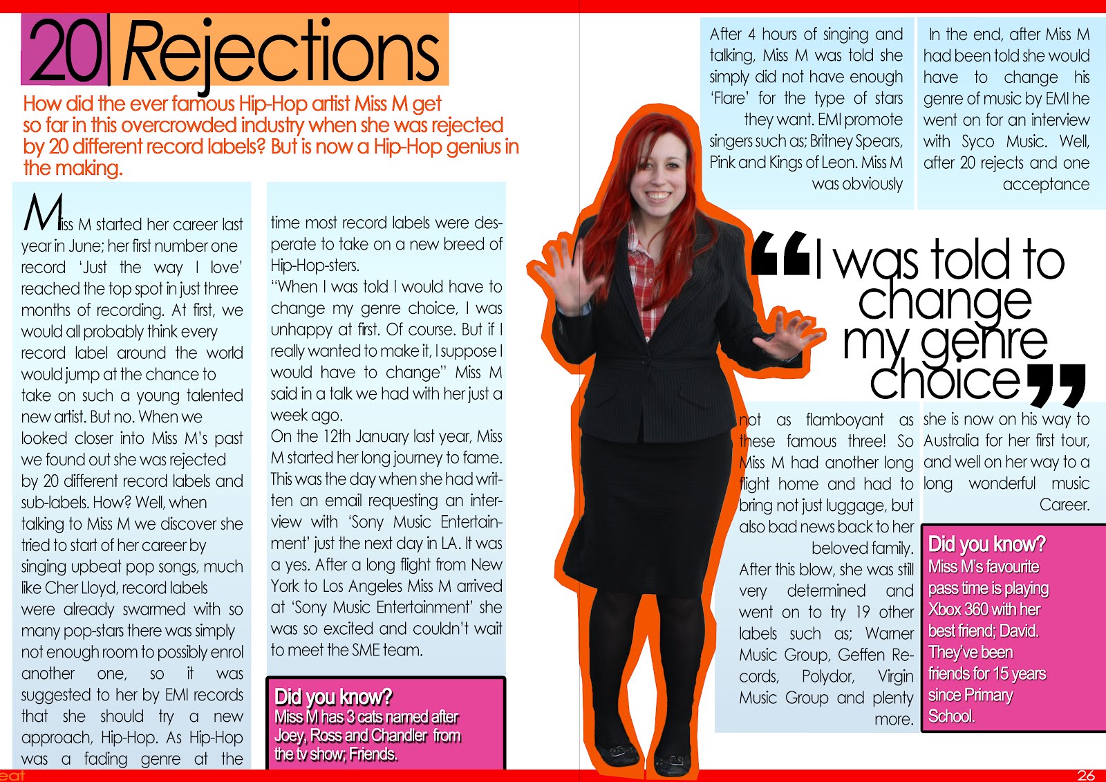
Double Page Spread


This is my final Double Page Spread.

Contents Page


This is my final contents page. I have used many different elements to create a contents page which is easy to navagate and use. I have used a similar colour scheme to the front cover so that it keeps with the house style.

Front Cover


This is my final front cover. It is the main part of my magazine as it is the first thing the readership will see if it was to be sold in shops. I have used bright colours so it is easy to see and will catch the readers eye's. The masthead is simple, and would be easy to reconise, as the colours on the front page are similar. My lead line is more in the centre of the page because it is the first thing I would want to readers to see after seeing the masthead, as it is the most important feature within the magazine. If this does not interest the reader, there is also cover lines with very short extracts from other features in the magazine which may draw the reader in.

Wednesday, 18 January 2012

Skills Development Journal

Skills development journal
View more presentations from emmarobinsonmediastudies.
This is my skills development journal, which includes things I learnt doing a practice magazine and my final.

Friday, 16 December 2011

Double Page Spread Article Research

For my Double Page Spread I want to write an article, therefore I have researched what sort of things feature in magazines such as VIBE using their website because the articles are going to be virtually the same.

Like this article, most of the stories and news are about drugs and troubled lives of Hip-Hop and R&B artists. The article is very short and get's straight to the point. Even though it's meant to be a 'Cool' magazine the language is quite formal, but not too formal to bore the reader. 
Wednesday, 14 December 2011

My final Masthead design


Here is my final design for my magazine masthead. The orange colour connotates brightness and fun, but the simple text shows simplicty and being laid back. I also decided to put some rectanglor boxes because those types of shapes are often linked with music and show the bass of songs on stereos and/or computer screens. Also, my font is a Sans-Serif font because my magazine is going to be similar to the magazine VIBE which doen't use a Serif font.

Survey Monkey Results!