Wednesday, 29 February 2012

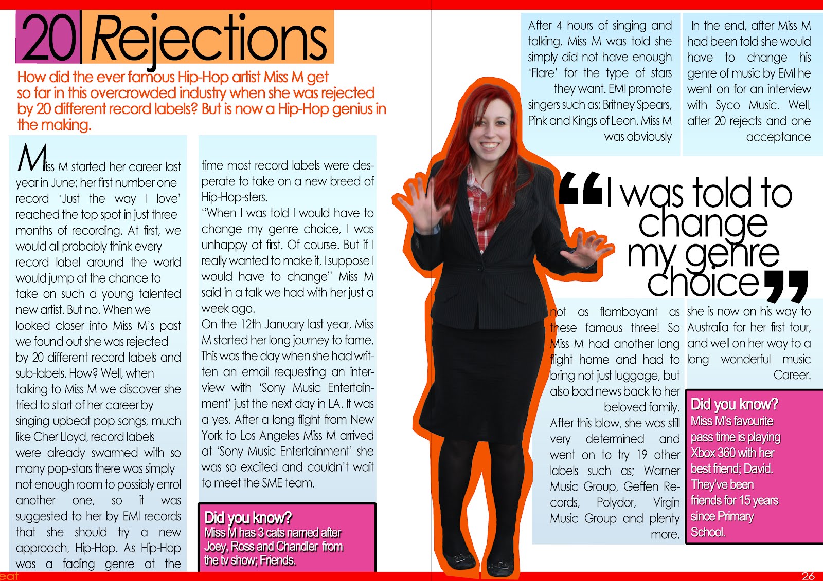
Double Page Spread


This is my final Double Page Spread.

Contents Page


This is my final contents page. I have used many different elements to create a contents page which is easy to navagate and use. I have used a similar colour scheme to the front cover so that it keeps with the house style.

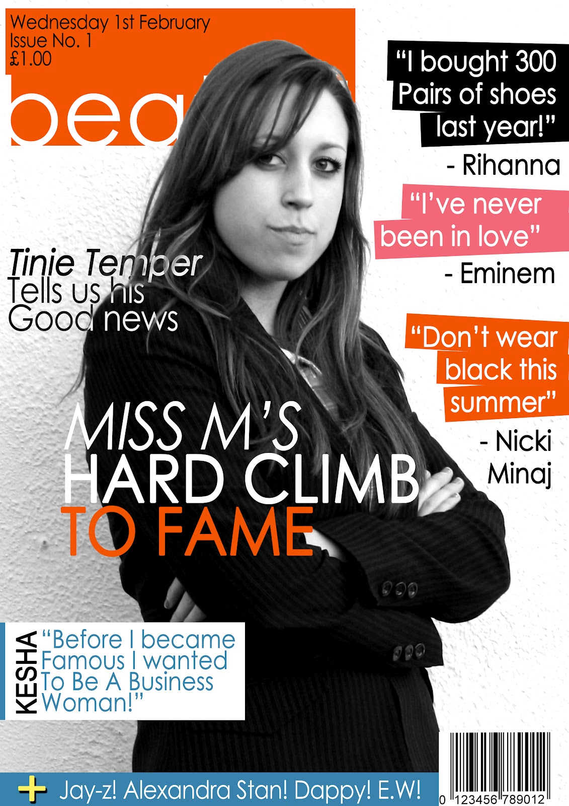
Front Cover


This is my final front cover. It is the main part of my magazine as it is the first thing the readership will see if it was to be sold in shops. I have used bright colours so it is easy to see and will catch the readers eye's. The masthead is simple, and would be easy to reconise, as the colours on the front page are similar. My lead line is more in the centre of the page because it is the first thing I would want to readers to see after seeing the masthead, as it is the most important feature within the magazine. If this does not interest the reader, there is also cover lines with very short extracts from other features in the magazine which may draw the reader in.

Wednesday, 18 January 2012

Skills Development Journal

Skills development journal
View more presentations from emmarobinsonmediastudies.
This is my skills development journal, which includes things I learnt doing a practice magazine and my final.

Friday, 16 December 2011

Double Page Spread Article Research

For my Double Page Spread I want to write an article, therefore I have researched what sort of things feature in magazines such as VIBE using their website because the articles are going to be virtually the same.

Like this article, most of the stories and news are about drugs and troubled lives of Hip-Hop and R&B artists. The article is very short and get's straight to the point. Even though it's meant to be a 'Cool' magazine the language is quite formal, but not too formal to bore the reader. 

Wednesday, 14 December 2011

My final Masthead design


Here is my final design for my magazine masthead. The orange colour connotates brightness and fun, but the simple text shows simplicty and being laid back. I also decided to put some rectanglor boxes because those types of shapes are often linked with music and show the bass of songs on stereos and/or computer screens. Also, my font is a Sans-Serif font because my magazine is going to be similar to the magazine VIBE which doen't use a Serif font.

Survey Monkey Results!

Wednesday, 7 December 2011

Interview idea..

I have researched what type of questions are asked in magazines I want to be similar to mine. I looked at an interview in VIBE magazine.The interview was about Jermiah. Here are some of the questions that were asked:

Which industry chick would you wife up?

You graduated from high school at 16. Are you a genius?

What's the craziest fight you have ever been in?

What's the worst thing your mother ever punished you for?

Your single ''I like'' sounds a bit like ''Birthday Sex''. Would you agree?

The language used in the questions go very well with the genre of music in the magazine. Certain Words like 'Chick' and 'Craziest' are used frequently within the Rap and Hip-Hop music therefore, are used in the interview to create a link with the genre's.

There is also another interview within the magazine which is much longer and has far more detail. This time they are interviewing Usher. Maybe it shows that Usher is more well known, therefore having a bigger interview. Questions that were asked:

Did marriage make you loose your edge?

...How do you feel about that?

What makes you a good lover?

And what do you think about sex?

When was the first time you felt worthy of being called Michael Jacksons heir apparent?

This time the interview is far more personal, it is also more set out as a conversation because when the interview is talking they use words and phrases like 'No.' or 'Because you cheated on her in the public eye' so sometimes, the interviewer isn't even asking him questions. I prefure this type of interview because you can get personal with the celebrities and find out just a little bit more about them. Also, language this time is slightly more formal, prehaps this is because they want Usher to seem more mature than the newer Jerimiah.

Layout

Each of the interviews are laid out with not many pictures, just one or two of the people being interview. For example the pictures of Usher have one A4 page to themselves which makes the layout more modern and clean. They both have lot's of white space on the page to create a more clean look.
Planning!

This is a mindmap which I drew so I could collect all my ideas for magazine together.

MY FLAT PLANS
This is the flat plan for my double page spread.
The front page flat plan.
This is my flat plan for my contents page


About BEAT magazine...

Welcome to the world of the Beat. It's time to relish in the modern lyric. We are here, standing in the middle, screaming your name, taking you to the front of row of the gig, backstage with the stars and on the stage with your mic. Bringing you the latest gossip within the R&B and Rap world. Turn the pages and hear the lyrics of the modern genius, hear the voice of your idols telling you their business. You will be in the know 24/7, because were right there, underlined on your weekly shopping list.

Friday, 2 December 2011

Moodboard

My Masthead Ideas

These are my three ideas of the type of Masthead I believe will stand out and make suit the theme of my magazine. Each one is sopiscated with fun colours to emphasise the fact my magazine is aimed at the younger generation. The fonts are simple, plain and easy to read from a distance.

Reader Profile


This is my reader profile. It includes what my reader is into, who they idolise, and I also have a pie chart which shows how they listen to their music which I got off of my survey.

Friday, 18 November 2011

Music Magazine Masthead's.


This is the masthead for 'Q' magazine, it differs from the masthead of Kerrang quite a bit. Q's masthead is very simple, and alsmost elegant whereas the masthead for Kerrang is very messy and represents the genre of music, Heavy Metal. Q magazine's genre of music is varied, because it mainly mainstream music which can vary in genre. I believe this is why their masthead is so simple, because it has to be able to cover various different types of music. It may have also been designed this way to appeal to the target audience who are mainly male and open minded towards most music but is mainly interested in mainstream tunes.

Kerrangs masthead is very different from Q's. It uses a more complex font, with extra edits such as; lines through the writing, which in turn makes it look rough and representst the genre of music the magazine is based around. Metal. It uses white on black, compared to Q's white on red, it appeals to a different target audience.

Friday, 11 November 2011

How does the journalist use written language to appeal to the target audience?

In this article the journalist uses descriptive language, such as ‘Crumpled crush barriers’ which makes the article seem violent which relates to the idea of the band being a rock band. This appeals to the target audience because stereotypically people who listen to rock music often enjoy violence and being 'rowdy'. The theme of the article is excitement for the band that is playing, often the language used is upbeat and descriptive, like ‘it was like the Pope came to town’ which compares it to a really exciting, important event. To make the article seem more realistic to the reader, the journalist uses descriptive words such as; 'gently' 'screaming' 'extraordinary' and 'fantastic'. All these words describe what is happening in good detail, which creates an atmosphere around the article.

Within the article there are key design features which help support the body copy. There are pictures of the band, with the crowd reaching out to them like they are somesort of God, this also links in with the quote 'It was like the Pope had come to town'. For each body of text there is a photograph which links into the quotes which makes the overall article easier to read and far more interesting.

Wednesday, 9 November 2011

KERRANG - Analysis


This is the front page of the magazine, Kerrang. Kerrang often features metal and rock bands and is meant to appeal to a target audience who listen to this type of music. Kerrangs masthead is placed right across the top of the page instead of being just to one side, this helps to make it stand out. The lead image is a full body or long shot of a band who features in the magazine,the expressions on the bands faces look serious, this connotates the magazine as being serious, unlike the fun upbeat feel of 'We ♥ Pop'. Cover lines for the magazine can be found on the top of the magazine above the Masthead, I believe these were put here so the reader can see them almost straight away and is drawn into what is going to be featured in the magazine. The colour scheme of the front page links in with the type of music genre that is featured through out the magazine, often the colour black is used to represent darkness which is in turn asscociated with heavy metal. Other colours, such as red and yellow are used because they may represent fire and violence which creates a very 'Gritty' feel around the magazine.
This is the Kerrang contents which includes everything that is featured inside the magazine. It is layed out to carry on the theme of the whole magazine, using the same colours and rough font. The 'lead image' on the contents is of a man with tattos, and looking like he is at a gig or partying. This reflects the 'VALs' of the sterotypical reader. The main body copy on this page is a message from the editor found at the bottom in the centre. Also, because the editors message is rather long it has been edited into two columns with a gutter in the middle to space it out correctly, this makes the editors note look more formal than the rest of the magazine. Like 'We ♥ Pop' featured articles which are not included regually and made to stand out more than regular articles by using pictures and larger text.


This is the double page spread for the magazine. It features a rock/heavy metal band. The lead image, which is of the featured band, is showing them looking down, which could represent them as being powerful and their facial expressions are serious. 


On this side of the double page spread, it features the article about the band, which is split up into two columns and a gutter through the middle to make it easier on the eye, and easier to read and understand. It also has a 'Pull Qoute' which will draw the readers attention the the main body copy.


NME - Analysis

NME, is also a magazine I bought to analyse. Again, it is a different theme to the rest of my magazines I analysed. This time I belive the target audience is young adults between the ages of 22-28 which are intrested in Indie bands and other famous singers. NME's masthead is placed on the top left, much like the 'We ♥ Pop' so it easy to spot on shelves. The colour theme is mostly red because it is a magazine aimed a wide variety of people and reed is one of the most popular colours, it also links in with NME's logo. The layout of the front page is eye catching. The largest text on the screen are the words 'ARTIC MONKEYS' which would appeal to the target audience if they are a fan of the band. The main image on the front page is a medium closeup of the band, The Artic Monkeys.


This is the contents page of the magazine, NME. It uses similar fonts, and images to the front page. The main font used is a Serif font, it is displayed right at the top of the page and the sentence 'INSIDE THIS WEEK' get's straight to the point of what the page is showing. Like most magazines the featured articles are bigger and with images unlike the normal pages which are smaller and less advertised because readers already expect them to be there. Each image is to do with an article inside the magazine.


The double page spread is an introduction to an article about the famouse band 'Artic Monkeys'. As it's an introduction there is not much text and the lead image is a huge picture of the band with the lead singer at the front. It also features a pull quote 'Ive got my leather trousers on' which could appeal to the audience becuase they often like to think of themselves as 'cool', therefore would like the leather trouser look. The colour red is used because it is a popular colour and stands out in the page to draw in the audiences eye. The way in which the band are shown are very laid back and typical lads just hanging around. A straight camera angle shows they are on the same level as their audience and do not aspire to be any higher or more important than other people.


The lead singer is postioned at the front of the group, showing power and importance over them, but yet he is still among them and doing similar things to them. His face is serious, this could connotate a serious article but at the same time he is smoking which is linked with being relaxed and chilled.